Wednesday, April 28, 2010

Building Pack

Putting the final pack together was relatively straight forward and quick. It was just a case of cutting out the net and sticking the tabs together. A breath of fresh air in comparison to the amount of time the design and illustration aspect and has taken!


Pack Developmet

I feel like I could have done endless layout alternatives for the pack. I wanted to extend the brief to include the pack as well, but I wanted to keep the design to the illustrations featured in each of the posters. It also gives me the opportunity to show them all together rather than patterns in their catagories, or as one large illustration on their own.

This is the overall shape of the net. It was pretty easy to wrk out. I simply took an existing pack, opened it all up at every seal and measured it. I then took the measurements to the computer and produced the basic shape in illustrator and began to drop in the content. 
Building the design...
As you can see this is what the compilation of all the illustrations would look like. This is probably the design I'd like to run with because I feel the two catagories of illustrations compliment each other well when put together. 
Back details...
Front, lower details...
Logo and contact details...
Every Don't Panic pack features the 'FREE' logo in the bottom right hand corner on the front. I replicated this by producing it with bold Helvetica type. 
Alternative design. One large illustration on the front of the pack...
I actually do quite like this. I know that Don't Panic do sometimes use two designs per issue for the front cover. Had I not liked the compilation of all the illustrations so much, I would probably run with a design like the large Gramophone above. 
The possibilities are endless...! Pattern also looks cool. I think after this project I would like to apply this pattern to a range of mediums, I think this could look really cool on tees. 
NOTE:

All my designs must be just kept to black line drawings or block, black colour because Don't Panic only ever print onto the packs in black. 

Final Poster Prints


These are the final A2 posters printed on a matt stock which I selected downstairs in digital print. It was easier to keep the stock the same down there than faff about with newsprint. Each newsprint sheet absorbed the ink slightly differently and because I have a block colour on the back, I was finding that each one was coming out at a different intensity of colour absorption. I also had to cut the newsprint down to size which wasted a fair bit of time getting them all the same and then to make matters worse, because it was so thin, the printer downstairs wasn't feeding it through very well and each print was off edge. These are the final prints...

Poster Stock Tests

Here I have experimented with newsprint and acetate. I really wanted to produce my posters on newsprint, but I discovered when I printed onto it, the quality wasn't what I was looking for. I really liked the acetate experiment, but it just didn't really work for the Don't Panic packs. I tried regular printer paper at 90gsm, but that too was just not the result I was after. I want to keep a matt and reasonably light stock but felt that the ones I tried just weren't right.
These are some of the experiments.

Thursday, April 15, 2010

Change of Typeface


I was using the typeface Futura before in my designs and felt that it just wasn't working. So I have decided to go with the nearest typeface I could find to the one Don't Panic use which is Rockwell. I have also added my name, copyright and contact detail.

Tuesday, March 30, 2010

Poster Development...

I have been further developing my poster designs to help me decide upon layout and scale. I want the image to be placed in the middle and for them to work as landscape. I have tried to use them as portrait and after showing my designs at the group crit decided that they functioned better as landscape. Also I have scaled them all up to be a similar size in the centre so that the illustrations inside them aren't lost by being too small. They all very intricate anyway and I don't want to lose the quality of them by scaling them down too small either. The next thing I want to consider is paper stock and colour of stock. I have considered using a coloured stock because I feel leaving them black on white is just too boring. They need some colour to help the beauty of the illustrations shine through. I shall show development of stocks and colour choices later...
I think these will be the final designs however that will be used, whatever they get printed on to.


Tuesday, March 23, 2010

Postcards - Final Designs and Development

The final postcards are to look like the enlarged cars on white immediately below. I have designed them on illustrator to have this plain white background to allow for me printing onto coloured stock. For the fronts of the post cards I have decided that I will print onto the same stock that the Don't Panic pack is printed onto. This is just regular brown paper. They shall be printed on that and then mounted onto plain white card, which shall have the reverse of the postcards printed onto. this will then give the postcard a two sided difference and the impression it is double sided stock. I want to keep the reverse info bit plain white so that it doesn't interfere with legibility when they're used.
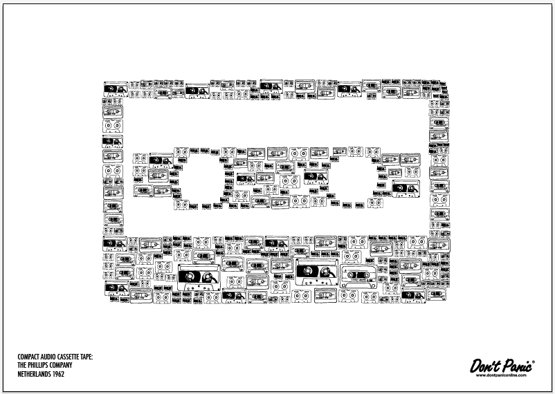
Screen grabs of all the final postcards...

Development postcards. The yellow designs are screen grabs to show what the designs would be like on a coloured stock, but because I know I want them to be on brown paper, I have left the final designs white so that no background colour is added.