I have been further developing my poster designs to help me decide upon layout and scale. I want the image to be placed in the middle and for them to work as landscape. I have tried to use them as portrait and after showing my designs at the group crit decided that they functioned better as landscape. Also I have scaled them all up to be a similar size in the centre so that the illustrations inside them aren't lost by being too small. They all very intricate anyway and I don't want to lose the quality of them by scaling them down too small either. The next thing I want to consider is paper stock and colour of stock. I have considered using a coloured stock because I feel leaving them black on white is just too boring. They need some colour to help the beauty of the illustrations shine through. I shall show development of stocks and colour choices later... I think these will be the final designs however that will be used, whatever they get printed on to.
The final postcards are to look like the enlarged cars on white immediately below. I have designed them on illustrator to have this plain white background to allow for me printing onto coloured stock. For the fronts of the post cards I have decided that I will print onto the same stock that the Don't Panic pack is printed onto. This is just regular brown paper. They shall be printed on that and then mounted onto plain white card, which shall have the reverse of the postcards printed onto. this will then give the postcard a two sided difference and the impression it is double sided stock. I want to keep the reverse info bit plain white so that it doesn't interfere with legibility when they're used.
Screen grabs of all the final postcards...
Development postcards. The yellow designs are screen grabs to show what the designs would be like on a coloured stock, but because I know I want them to be on brown paper, I have left the final designs white so that no background colour is added.
Building my images has turned into a VERY time consuming process. I have also had quite a few problems. I found that copying and pasting all my vectors time over to place them was making the file size become MASSIVE. It was slowing down my computer (Which is a pro with LOADS of free space) and causing Illustrator to force quite. I spose to one of our technicians at college and he told me a very valuable lesson...
- One you have created your vector illustrations and have filled them etc exactly how you want them to look save them all individually as symbols in your symbols palette. This means that you can literally drag as many of your vectors out and repeat them over and over, but it keeps the file size down and doesn't confuse your mac! You are still able to scale the symbols how you want as small or large as you want and they won't pixelate. However, one thing you can't do once you have saved them as symbols is go back and edit them. For example give them a different colour fill. But for me and the sake of what I am trying to do in this project it worked a treat, saved time and frustration. Cheers Mike! :)
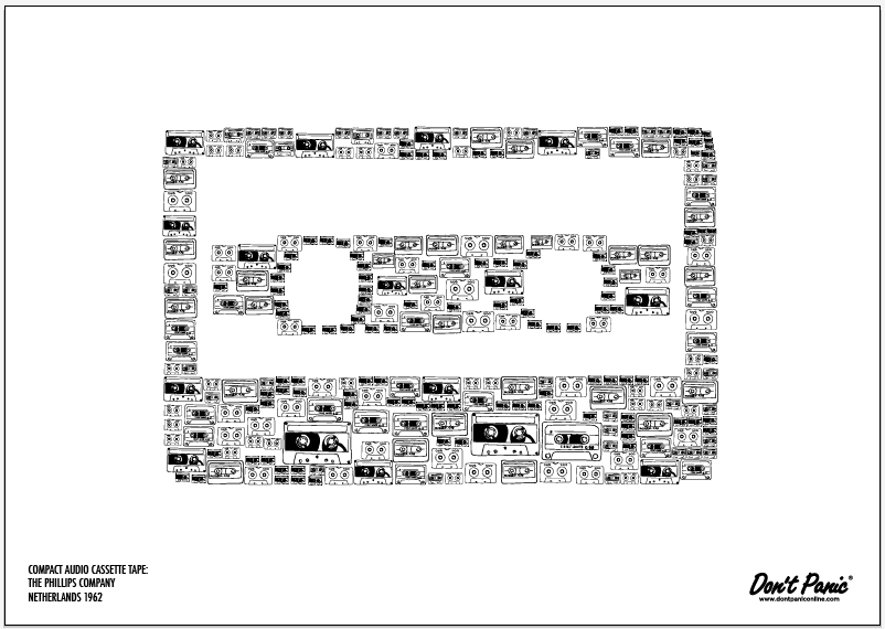
Below you can see screen grabs of how I have built my images out of my vectors. (When I was producing the car, wheel and plane out of the transport category I hadn't realised that I could make the vectors into symbols and it was very much a pain staking process and time waster.) It is quite a slow process to make these images, especially if you are fussy with how much detail you want the images to contain. Or how dense you want it to look. I quite like it being dense so that when you look into it further you can see more detail. This may or may not be a good thing, especially as it is taking all my time to do these and I'm having to neglect my other briefs........
I'm Liv. A third Year Graphic Design student at The College Of Art in Leeds. I'm interested in design for digital and traditional print, commercially orientated applied graphic illustration and photography.