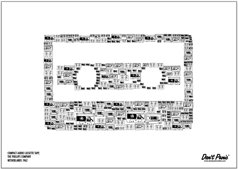
I have been further developing my poster designs to help me decide upon layout and scale. I want the image to be placed in the middle and for them to work as landscape. I have tried to use them as portrait and after showing my designs at the group crit decided that they functioned better as landscape. Also I have scaled them all up to be a similar size in the centre so that the illustrations inside them aren't lost by being too small. They all very intricate anyway and I don't want to lose the quality of them by scaling them down too small either. The next thing I want to consider is paper stock and colour of stock. I have considered using a coloured stock because I feel leaving them black on white is just too boring. They need some colour to help the beauty of the illustrations shine through. I shall show development of stocks and colour choices later... I think these will be the final designs however that will be used, whatever they get printed on to.
I'm Liv. A third Year Graphic Design student at The College Of Art in Leeds. I'm interested in design for digital and traditional print, commercially orientated applied graphic illustration and photography.


No comments:
Post a Comment